

What a Small Business Website Actually Needs to Do Its Job
TL;DR
A website doesn't need to be flashy to work. It needs to load fast on a phone, say clearly what you sell, and make contacting you a single tap away.
The Non-Negotiables
Before you think about design trends or clever copy, a site has to clear a much lower bar first: it has to load fast and work cleanly on a phone screen. Most people finding you for the first time are doing it standing in a parking lot, on a lunch break, or scrolling while a pot boils over on the stove, not sitting at a desktop with patience to spare. If your homepage takes more than a couple of seconds to show anything, or if the text runs off the edge of a phone screen, most of those visitors are gone before they ever see what you sell.
Once it loads, it needs to say what you do without making anyone scroll or guess. Not a tagline that sounds good in a pitch meeting, a plain statement of what you sell and who it's for, right at the top. "Hmong egg rolls and catering in St. Paul" tells a hungry visitor more in five words than "Bringing families together through food" does in a full sentence, even though the second one might feel more like something a website is supposed to say.
The rest of the non-negotiable list is short:
- Your hours and address have to match exactly what's on your Google listing — a mismatch there costs more trust than people realize.
- A way to reach you, a phone number, a booking link, a "text us" button, has to be visible without hunting for it.
- HTTPS, the padlock icon next to your web address, isn't optional either.
Every major browser now flags sites without it as "not secure," and that warning alone is enough to send a first-time visitor straight back to their search results. Most hosting providers include it for free now, so there's no real excuse for leaving it off. If you're still deciding where to build the site itself, the Shopify vs. WordPress comparison is worth a read before you commit to either.
Why Your Phone Is the Real Homepage
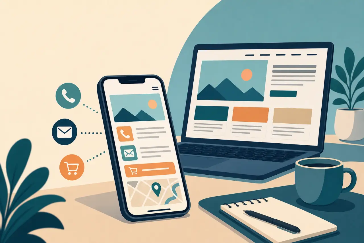
Most of the traffic hitting a small business site today arrives on a phone, not a laptop, and that changes what "good design" actually means. A layout that looks sharp on your desktop monitor while you're building it can turn into a wall of tiny text and buttons a thumb can't accurately hit once it's opened on someone's actual phone. The only real way to know is to open your own site on your own phone, on mobile data instead of your home Wi-Fi, and try to do the one thing you'd want a stranger to do: find your phone number, or place an order.
Small details matter more here than they seem like they should. A phone number that's just typed as plain text won't let someone tap it to call, it has to be formatted as an actual link, the same way an email address should open a mail app instead of making someone copy and paste it. Forms are the biggest phone killer: if booking an appointment or requesting a quote means typing a paragraph into a tiny box, most people will just bail and call instead, which is fine, but only if that number is easy to find. Keep any form to the handful of fields you truly need, name, phone, what they want, and cut the rest.
What Has to Be Visible in the First Five Seconds
Think about the first screen someone sees, before they scroll at all, as the only part of your website some visitors will ever read. It needs to answer three questions without making anyone work for the answer:
- What do you do?
- Where are you?
- What should I do right now?
A landscaping crew's homepage doesn't need three paragraphs about its founding story above the fold, it needs "Lawn care and landscaping serving the Twin Cities" and a button to call or get a quote, visible without scrolling.
One line of real trust near that same first screen helps more than people expect, a star rating pulled from your Google reviews, "serving the Twin Cities since 2011," or a single photo of the actual shop or crew instead of a stock image. It doesn't need to be elaborate. It just needs to tell a stranger, in the first few seconds, that a real business with a real track record is behind the page.
A lot of small business sites hurt themselves right here by cramming in a rotating image slider, an autoplay video, or several calls to action competing for the same click. Pick the one action you want most people to take, call, book, or order, and make it the loudest thing on the page. Everything else on that first screen should support that one action, not compete with it.
Contact and Location: Remove Every Extra Step
Every extra step between someone deciding to reach you and actually reaching you is a chance for them to give up and call your competitor instead. That means your phone number, address, and hours shouldn't live only on a "Contact Us" page buried in a menu, they belong in the header or footer of every page, so no matter where someone lands, the way to reach you is already on screen.
An embedded map matters more than it might seem, especially for anyone unfamiliar with your neighborhood, a strip mall, a shared building, or a spot behind another business are all places a first-time visitor can drive right past. A simple embedded map with a pin, not just a typed-out address, gets them there without opening a separate app and guessing. If you take appointments, an hours display that actually reflects holidays and the days you're really closed builds more trust than a stale "Mon-Fri 9-5" that hasn't been true in years.
List the contact channels you genuinely respond on, not the ones you assume a website is supposed to have. For a lot of Hmong-owned businesses, that means channels like these, more than a generic contact form:
- Texting
- Facebook Messenger
- Walk-ins for a nail appointment
- A phone call for a catering order
A "Contact Us" page with an email form nobody checks does more harm than good, it gives visitors a dead end and makes you look unresponsive even if you're fast to reply everywhere else.
What Separates a Site That Works From One That Just Exists
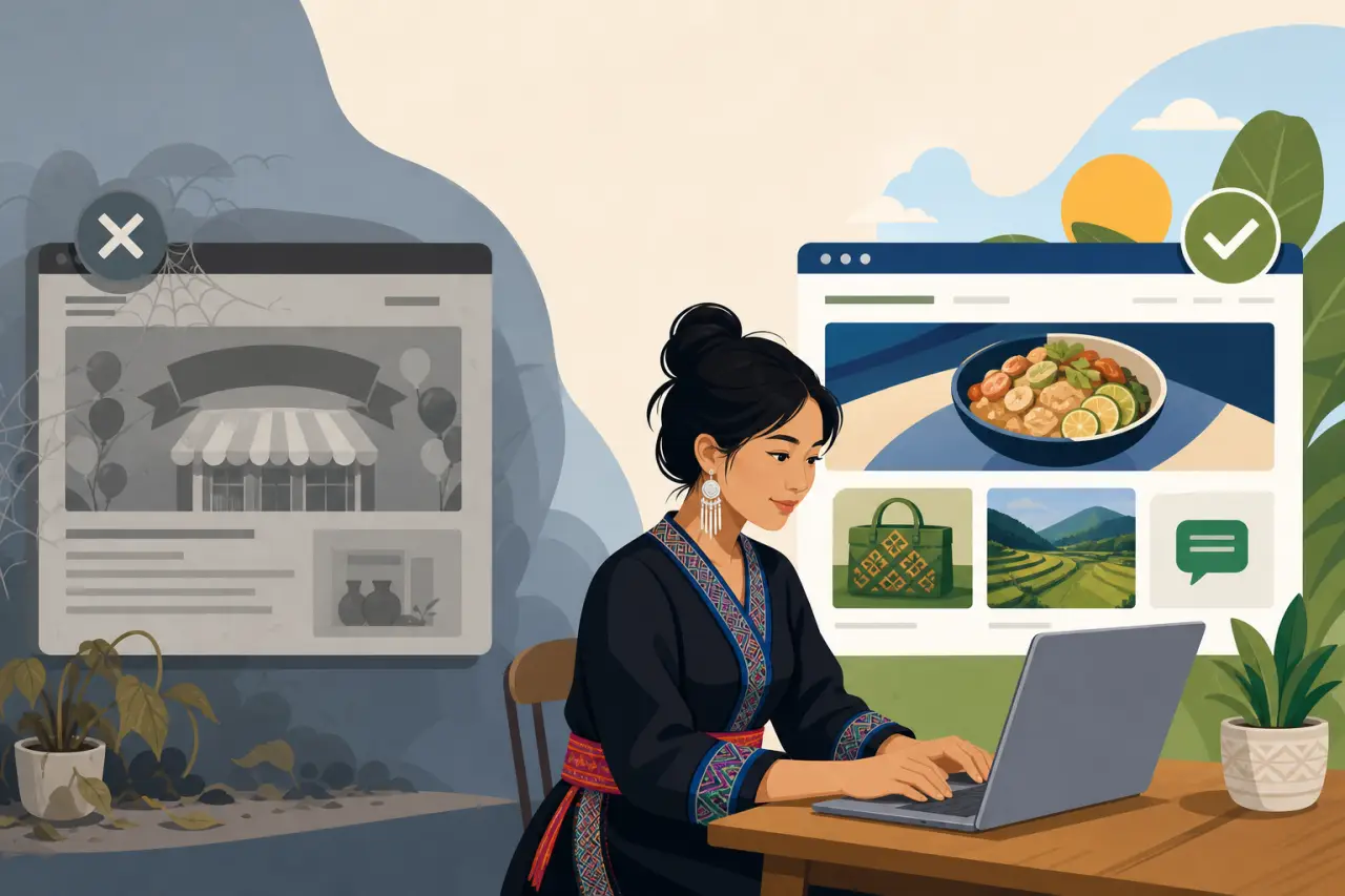
A lot of small business websites get built once, during a slow week or right after opening, and then never touched again. It shows. A homepage still announcing a "Grand Opening" three years later, or a seasonal menu that never changed since Thanksgiving, tells visitors, and search engines, that nobody's minding the site anymore. These are exactly the kind of details covered in a rundown of the mistakes quietly costing you customers — small oversights that add up fast.
The businesses that keep pulling in customers through their website tend to touch it occasionally:
- A seasonal special
- A new product
- A short answer to a question customers keep asking at the counter
None of that requires a redesign. It can be as small as swapping a homepage photo for the season or adding one paragraph about a new service. Search engines read that kind of small, regular activity as a signal that a real, active business is behind the page, and they tend to favor pages that update over pages that haven't changed in years. That's just one piece of the SEO basics behind your ranking — freshness is a signal search engines weigh, not the whole picture.
Real customer testimonials do more work here than most people expect, especially two or three specific ones over a wall of generic five-star badges. "Sokha handled our whole wedding catering and the sticky rice was gone in twenty minutes" tells a stranger something a plain "Great service!" never will. Pair that with a clear next step on every page, Call now, Order online, Book a visit, and the site stops being a static brochure and starts actually doing sales work.
Photos That Actually Build Trust
Nothing signals "this is a real, currently-operating business" faster than a real photo, and nothing signals the opposite faster than a stock photo of models in a kitchen that looks nothing like yours. You don't need a professional photographer to fix this, a handful of clear, well-lit photos taken on a phone during daylight, of your actual storefront, your actual food, your actual crew, will do more for trust than an expensive photoshoot of something generic.
A few specific shots matter more than a big gallery:
- The front of your building, so people recognize it when they drive up
- A couple of your best-selling dishes or products, shot close and well-lit
- At least one photo with people in it — you, your staff, your family, whoever actually runs the place
A business with real faces attached to it reads as more trustworthy than one that hides behind graphics and clip art, and for a lot of Hmong-owned businesses that family history and connection is genuinely part of the pitch, so let it show instead of covering it up with generic stock imagery.
Serving a Bilingual Community Without Building Two Websites
If part of your customer base is more comfortable in Hmong than English, you don't need to build and maintain two parallel websites to serve them well. A full translation of every page is a lot of ongoing work for a small team to keep in sync, and a half-translated site where some pages are current and others are years old ends up looking more neglected than one language done properly. A more realistic middle ground: keep the main site in whichever language most of your written communication already happens in, and translate the handful of things a customer actually needs at a glance:
- Your hours
- Your phone number
- A short greeting
- How to place an order
For a lot of Hmong-owned businesses, word of mouth and phone calls do more of the actual selling than the website's written copy ever will, so the site's real job in that language is often just confirming you're legitimate and giving someone an easy way to call. Making sure your phone number is prominent and your hours are accurate matters more here than a perfectly translated paragraph nobody reads before picking up the phone anyway.
What to Skip: Features That Cost More Than They're Worth
It's easy to assume a "real" website needs everything a big company website has:
- A blog
- A live chat widget
- An online store
- A members' area
For most small, service-based businesses, most of that adds maintenance work without adding customers. A blog nobody has time to update becomes a page stuck on a single post from two years ago, which does more damage to how current the site looks than not having a blog at all. A chat widget that shows "we typically reply in a few hours" but never actually gets answered trains visitors to distrust every chat widget on the site going forward.
The same goes for online ordering or booking systems: if you don't have the staff to actually monitor and fulfill orders that come through the website, a "call or text to order" instruction is more honest and more reliable than a checkout cart that occasionally gets missed. Picking the right foundation in the first place matters more than any single feature, working through choosing between Wix and WordPress up front saves you from fighting a platform that was never built for what you actually need. Add these features once you've outgrown the phone-and-walk-in model, not because a website template happened to come bundled with them. A smaller site that does a few things reliably will out-earn a feature-heavy one that does most of them halfway.
Questions people ask
How fast does a small business website actually need to load?
It should show something within a couple of seconds. Most first-time visitors are on a phone in a parking lot or on a break, not sitting at a desktop with patience to spare. If your site takes longer than that, most people are gone before they see what you sell.
Should I translate my entire website into Hmong if my customers speak it?
Not necessarily. A full translation of every page is a lot of ongoing work to keep current. Instead, translate just what customers need at a glance: your hours, phone number, a short greeting, and how to order. Word of mouth and phone calls do most of the selling anyway.
Does my small business website really need a blog?
Only if you have time to update it regularly. A blog stuck on a single post from two years ago does more damage than not having one at all. It signals that nobody's minding the site. Skip it unless you'll actually maintain it.
What should be the first thing people see when they land on my homepage?
Three things, without scrolling: what you do, where you are, and what to do next. A landscaping crew needs "Lawn care serving the Twin Cities" and a button to call or get a quote, not a paragraph about your founding story.
Written by
Hmong Network Team
Directory & Digital Services
We run the Hmong Network directory and do the web design and SEO/AEO work behind the results in our case studies. These guides come out of that same hands-on work with Hmong-owned businesses — not secondhand research.
