
Why Your Ads Aren't Working: A Small Business Guide to Banner Blindness
TL;DR
Customers have trained their eyes to skip anything shaped like an ad, no matter how good it looks — the fix isn't a flashier banner, it's putting your message where people are already paying attention and making it read like real information instead of a pitch.
Why People Stop Seeing Your Ads
After years of seeing the same kind of box in the same kind of spot — a bright rectangle at the top of a page, a sidebar strip, a pop-up right when you land on a site — people's eyes have learned to skip those zones automatically. It happens before a person has time to actually read what's in the box. This isn't about your design being bad. A genuinely well-made ad sitting in a spot that looks like every other ad still gets skipped, because the skipping happens at the shape and location, not the content.
The same reflex shows up offline. A bright yellow "SALE" sign taped inside a shop window reads as background noise the moment a passerby's brain recognizes the shape — even if the sale itself is a genuinely good one. A flyer stapled to a community board next to twenty other flyers gets the same treatment. The lesson isn't "don't advertise." It's that the packaging itself can cancel out the message before anyone reads it, so the fix has to start with how something looks and where it sits, not just what it says.
It Follows People Everywhere, Not Just Your Website
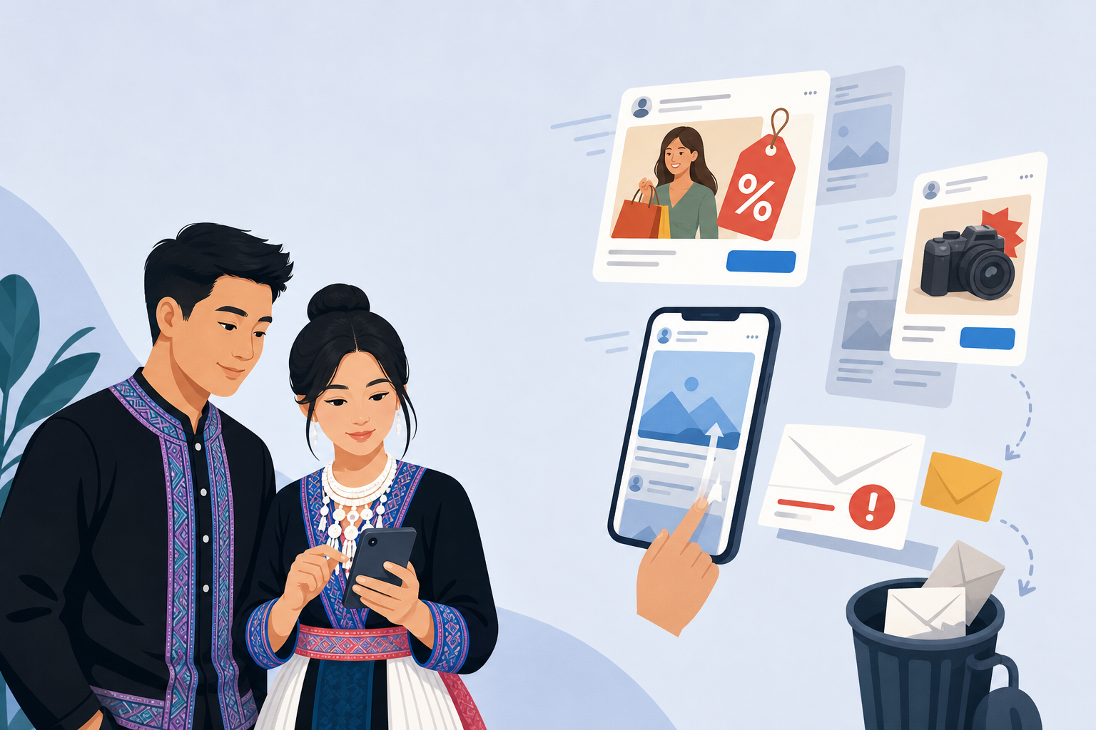
Banner blindness isn't a website-only problem, and treating it that way is why a lot of small business marketing quietly underperforms. On social media, a post that's obviously a paid ad — stock photo, big price tag, a "Shop Now" button — gets scrolled past at the same speed as a banner ad, even in a feed people are otherwise reading closely. That's a strong argument for showing up consistently on one platform instead of spreading thin, obviously-promotional posts across every channel you have. A promotional email with a subject line like "HUGE SALE THIS WEEKEND" gets the same treatment your spam folder trains people to give: deleted or ignored without opening, while an email that reads like a real update from a real person gets opened.
It shows up in text messages too. A mass text that opens with a discount code and an all-caps offer reads like spam the moment it's read, and some customers will block the number outright. A text that reads like it's actually from the owner — "the tamales you asked about are back in this week, want us to hold you a dozen?" — gets answered. Same channel, same business, completely different result, because one looks like an ad and one looks like a message from someone who knows you.
Make It Look Like It Belongs, Not Like an Interruption
The promotions that still get noticed tend to look like part of the content someone was already reading, not a separate box competing with it. A short video of the person actually cooking a dish, with the price and availability mentioned naturally in what they're saying, holds attention in a way a graphic with a discount slapped on top never will — because a viewer's brain doesn't file it under "ad" until it's already partway through watching. A customer's own photo of a finished haircut or a plate of food, shared with a caption about what's available this week, reads as a recommendation even though it's doing the same job as a banner would.
For a small, Hmong-owned business, this usually means leaning on what a template or stock-photo ad can't fake: a real face, a real voice, a real detail specific to your shop. A short clip of an aunt explaining why she uses a particular herb blend in her egg rolls does more than a graphic that just says "Now Serving Egg Rolls" — the explanation is the content, and the offer rides along inside it instead of announcing itself first. If a post looks like it was built from a template anyone could have made, it's going to get the same glance-and-skip treatment as an actual ad, even if you didn't pay to boost it.
This also means resisting the urge to polish a message until it looks professional in the way an ad agency's work looks professional. A slightly shaky video of the actual cook explaining a dish outperforms a smooth, studio-lit graphic promoting the same dish, because the shakiness itself is a signal that it's real and not paid content. Customers have gotten good at spotting the difference between something made to sell them and something made to tell them — lean toward the second one even when it feels less polished, because polish is exactly what triggers the skip reflex. In practice, that means leaning on your brand's own authenticity instead of trying to look like a bigger company than you are.
Put Your Message Where People Are Already Looking
Skip the traditional ad zones and think about where a customer's attention is already landing on its own, without you having to fight for it — online and in person alike:
- A receipt is read by almost everyone who gets one — a line at the bottom mentioning next week's new menu item gets seen by people who'd never notice a poster by the register.
- An order-confirmation text or email gets opened because people want to know their order went through — a single added sentence about an upcoming pop-up rides along on attention that's already there for free.
- A verbal mention at checkout — "we've got a new lotion bar in this week, want to smell it?" — reaches someone who has already tuned out every flyer on the counter next to the register.
- A small card tucked into a bag of goods gets read later, at home, when there's no other marketing competing for attention.
None of these placements cost anything close to a paid ad campaign, and all of them route around the reflex that makes people skip banner-shaped things, because none of them look like a banner in the first place. Placements like these do double duty: they get seen, and they're exactly the kind of low-key touchpoint that goes into turning first-time visitors into repeat customers.
The Words You Use Are Doing Half the Work
Even a perfectly placed message can trip the same ad-blindness reflex if it's worded like an ad. "SALE!! LIMITED TIME!! DON'T MISS OUT!!" reads as a banner in plain text, no graphic required — the exclamation points and all-caps do the same job a flashing yellow box would. Specific, plain language does the opposite: "We made extra sausage this batch, ask at the counter while it lasts" reads like a real update because it sounds like something an actual person would say, not a marketing department.
This matters most in the channels where people expect a person, not a brand — a text message, a caption, a conversation at the register. Swapping "20% OFF ALL ITEMS" for "most folks are getting the family-size portion this week, it's $4 more and feeds two extra people" gives the same information but reads as advice instead of a pitch. It takes a little more time to write than a generic discount line, but it's the difference between a message that gets read and one that gets the same half-second glance a banner gets before the eye moves on.

Testing What Actually Gets Noticed, Without Any Special Tools
You don't need ad software to find out what's working — you need a way to tell your placements or wordings apart. Give two different versions of an offer two different names or codes: mention "the counter special" in person and "the online special" in a text, then count which one people actually ask about or use over a week or two. If a Facebook post with a customer photo gets more comments and messages than a post with a graphic advertising the same item, that's your answer for what to do next time, no analytics dashboard required.
The same goes for placement — try running two versions back to back and see which wins:
- Mention a new item at checkout for two weeks.
- Switch to a printed card in the bag for two weeks.
Then pay attention to which one actually generates questions or repeat requests. Small business owners already do a version of this instinctively — noticing which conversations lead to a sale — the only change is doing it on purpose and comparing results instead of guessing. The goal isn't a perfect experiment; it's enough signal to stop guessing at what your customers tune out.
Keep the comparison simple enough that you'll actually stick with it. A notebook by the register with two columns, or a couple of tally marks on your phone each time someone mentions an offer, is enough — the point is comparing two real options against each other rather than assuming the version that took more effort to make must be the one working better. Often the plain, low-effort version wins, which is itself useful information: it means you can spend less time on the graphic and more time on the wording.
Where This Shows Up on Your Hmong Network Listing
The same principle applies to your business listing itself. A listing description that reads like ad copy — "BEST PRICES IN TOWN, CALL NOW" — gets the same skim treatment a banner does, even from someone who already searched for exactly what you offer and landed on your page wanting to find you. A description that answers the actual questions a customer has — what you make, what makes it different, what a first-time visitor should know before they come in — reads as useful information instead of a pitch, and it's also what search engines and AI tools tend to surface when someone asks a specific question. It's one of several website mistakes that cost you customers that are easy to fix once you know to look for them.
The same goes for any coupon or offer you post to your listing: a coupon titled "10% off" with no context blends into every other 10%-off coupon a customer has scrolled past. One that explains what it's for and why — "10% off your first catering order, good through the end of the month" — reads like a real, time-bound offer rather than a generic discount box. If you're claiming or updating your listing, treat the description and photos the same way you'd treat a receipt line or a text message: specific, plain, and written like it's meant to be read, not skimmed past.
Common Mistakes That Make Banner Blindness Worse
A few habits make the problem worse without a business owner realizing it:
- Reusing the exact same graphic across every platform trains your own regular customers to tune it out the same way they tune out a banner ad — by the third time someone sees an identical image, their eyes have already learned to skip it.
- Stacking multiple calls to action in one post or message — "Call now! Visit our website! Follow us! DM for details!" — does the same thing a cluttered ad does: it looks like an ad because it's structured like one, with no single clear thing being said.
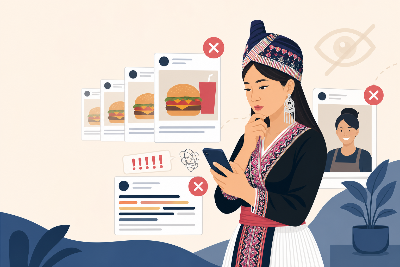
- Leaning on stock photography — a generic image of hands holding a burger or a stock photo of a smiling stylist reads as advertising instantly, because it looks like every other stock photo a customer has scrolled past for years, even when the product or service behind it is completely real and specific to your shop.
Swapping in your own photo, even an imperfect one taken on a phone, does more to get past the reflex than a polished but generic image ever will, because it signals "this is actually from a real place" before a customer has consciously registered why.
Questions people ask
Why do people ignore ads even when they're well-designed?
People's eyes have learned to skip ad-shaped things automatically — bright rectangles at the top of pages, sidebar strips, pop-ups. This happens before anyone reads the actual content. A well-made ad in a typical ad spot still gets skipped because the skipping happens at the shape and location, not the message itself.
How do I make my ads look less like ads?
Make your message look like content someone was already reading, not an interruption. Use your own face, voice, and real details specific to your shop instead of templates or stock photos. A slightly shaky video of you explaining a dish outperforms a polished graphic because shakiness signals it's real, not paid content.
Where should I put my promotions so people actually see them?
Put messages where customers are already looking: on receipts, in order-confirmation emails, in a verbal mention at checkout, or on a card tucked into a bag. These placements cost nothing and bypass the reflex that makes people skip banners because they don't look like ads at all.
What words should I use to make my offer stand out?
Use specific, plain language that sounds like a real person talking, not a marketing department. Instead of 'SALE!! LIMITED TIME!!' try 'We made extra sausage this batch, ask at the counter while it lasts.' It reads like advice instead of a pitch and gets people's actual attention.
Written by
Hmong Network Team
Directory & Digital Services
We run the Hmong Network directory and do the web design and SEO/AEO work behind the results in our case studies. These guides come out of that same hands-on work with Hmong-owned businesses — not secondhand research.