

LoveLee Beginnings: An Atlanta Wedding Planner Case Study
TL;DR
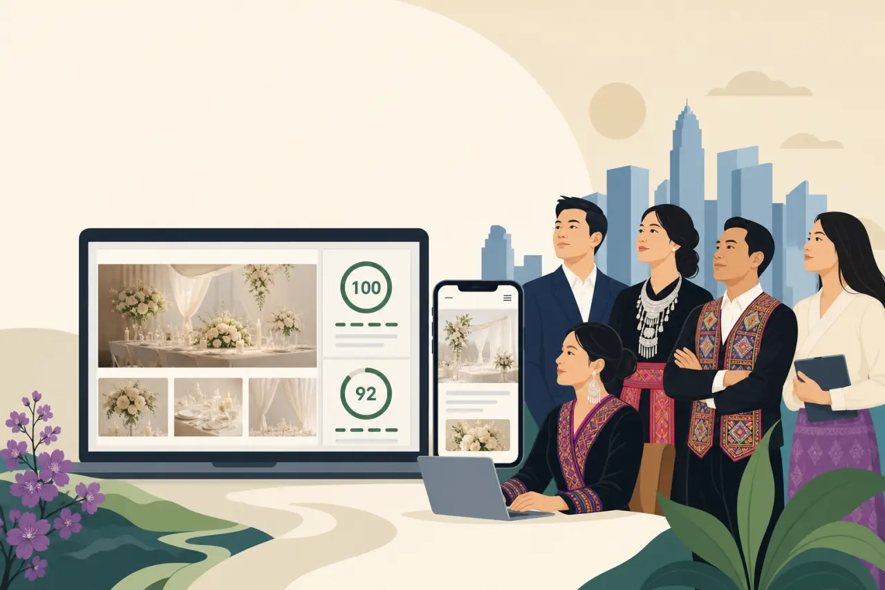
LoveLee Beginnings is a Hmong-owned wedding planning business serving Atlanta's competitive market with personalized, culturally aware event coordination. Hmong Network rebuilt its WordPress site with a watercolor-and-gold identity and a blended keyword strategy, landing a perfect 100/100 desktop PageSpeed score and a 92/100 SEO score on both desktop and mobile.
A Business Whose Work Was Better Than Its Website
LoveLee Beginnings serves Atlanta's competitive wedding market with personalized, culturally aware event coordination. That last phrase matters more than it might first appear. Wedding planning is not a service where every provider is interchangeable; couples are hiring someone to understand not just logistics but the specific traditions, family dynamics, and expectations that will shape their day, and a planner who can navigate that well is offering something a generic coordinator cannot.
The problem was that none of this showed up online. As couples increasingly started their vendor search on Google and Instagram rather than through word-of-mouth referrals, LoveLee Beginnings' existing online presence didn't reflect the quality of the work it actually delivered. That gap is common for service businesses built on reputation rather than marketing, but it becomes a real liability once discovery shifts to search. A couple who has never heard of the business has nothing to go on except what the website tells them in the first few seconds, and a site that undersells the work is effectively lying by omission about what the business can do — a lesson explored in what your website actually needs to do.
There was a second layer to the challenge, one that shows up across almost every minority-owned business Hmong Network has worked with: as a minority-owned business, LoveLee Beginnings also faced the challenge of competing for visibility against established firms with much larger marketing budgets. Larger wedding-planning firms in a market the size of Atlanta can afford paid ads, dedicated PR, and years of accumulated search authority. A smaller, independent operation has to win that same visibility through better-built fundamentals — a faster site, cleaner structure, and sharper targeting — rather than simply outspending the competition.
Designing for Three Audiences That Rarely Want the Same Thing
Before any design work started, the project had to reconcile a set of requirements that pull in different directions. The site needed to serve engaged couples, family members, and vendors at once — three groups with genuinely different reasons for landing on the same page:
- A couple wants to see style, personality, and proof that this planner gets their vision.
- A family member, who in many cultures plays an active and sometimes financially involved role in wedding planning, wants reassurance about professionalism and reliability.
- A fellow vendor — a photographer, a venue coordinator, a florist — is evaluating whether this is someone worth referring clients to or collaborating with on future events.
A homepage speaking to only one of those audiences risks losing the other two.
Layered on top of that was the cultural question at the center of the whole project: the site needed to balance cultural authenticity with broad market appeal — honoring the business's Hmong heritage, including the traditions behind a Hmong wedding many couples want reflected in their ceremony, without limiting its appeal to non-Hmong couples. Lean too far in either direction and the site fails a different audience: present the business as generically as every other Atlanta wedding planner and it loses the identity that sets LoveLee Beginnings apart; present it as narrowly Hmong-focused and couples outside that community might mistakenly assume the services aren't meant for them.
The brief also had a harder technical constraint sitting underneath all of this: wedding planning is an inherently visual business, so the site needed an effective visual portfolio without sacrificing load times or mobile responsiveness. A slow, image-heavy portfolio is a common example of the website mistakes that cost you customers — the same photos that are supposed to sell the work end up driving visitors away before they finish loading.

Watercolor and Gold: A Visual Language Built to Travel Across Cultures
Hmong Network built the new site on WordPress around watercolor accents and gold elements, aiming for elegance that stayed culturally neutral rather than overtly themed. That choice was a deliberate answer to the authenticity-versus-appeal tension described above, and it's worth explaining why watercolor and gold specifically solved it.
Soft watercolor washes read as romantic and personal without pointing to any single cultural tradition — the same visual language shows up across wedding branding globally, from Southern garden weddings to modern minimalist ceremonies, which means it doesn't inadvertently signal "this is for one specific kind of couple" the way an overtly themed design might. Gold accents add a sense of occasion and craftsmanship without leaning into a specific motif. Together, they create a canvas elegant enough to hold any couple's vision, while leaving room for cultural specificity to live in the content and storytelling — in the About Us page, in portfolio captions, in the planner's own voice — rather than being baked into the base palette where it could unintentionally narrow the audience before a visitor ever reads a word.
WordPress was also the right platform choice for reasons that go beyond this one launch. A wedding portfolio is never really finished — every completed event is another set of photos, another testimonial, another opportunity to update the site — and WordPress gives LoveLee Beginnings a system it can keep adding to without needing a developer for every small update, which matters for a business whose best marketing material is generated one wedding at a time.
Engineering the Homepage as a Sequence of Trust Signals
The homepage followed a deliberate flow, with each element doing a distinct job and the order it appears in far from incidental:
- The hero section with wedding imagery is the first impression — within a couple of seconds, a visitor should be able to tell whether the aesthetic matches what they're picturing for their own day.
- A personal welcome with a portrait follows immediately, shifting the page from "a wedding planning company" to "a specific person you could actually talk to." Wedding planning is an intimate, trust-heavy purchase — couples are handing a stranger one of the most significant days of their lives — so putting a real face and voice early in the page earns that trust before a single service is described.
- The services overview in circular thumbnails lets a visitor scan what's actually offered without wading through paragraphs of text — a format suited to browsing behavior, since many visitors are comparing several planners' sites in the same sitting and won't read dense copy on any one of them.
- The integrated booking form sits on the homepage itself rather than being buried behind a separate page, so a visitor who is already convinced doesn't have to go hunting for the next step; every extra click between interest and action is a chance to lose someone.
- The Google review badge for credibility closes the sequence with third-party proof, placed close to the point of conversion specifically because that's where last-minute hesitation tends to show up — a visitor ready to fill out the booking form benefits from one more piece of evidence that other real couples trusted this planner and were happy with the result.
Eight Pages, Each Answering a Different Question
Eight primary pages made up the site — a compact structure, but each one answering a question the homepage can only gesture at:
- Services spells out exactly what's included at each level of engagement, since "wedding planning" can mean anything from full-service coordination to day-of logistics, and couples need to know precisely what they're evaluating.
- About Us carries the personal and cultural story that the neutral homepage palette deliberately left room for — this is where LoveLee Beginnings' Hmong heritage and the planner's own background get to be specific rather than implied.
- Booking turns interest into a scheduled conversation.
- Testimonials works alongside the Google review badge rather than duplicating it — the badge is a quick, low-effort trust signal, while the Testimonials page gives space for fuller stories from past couples.
- FAQ handles the practical questions that would otherwise become phone calls or unanswered emails — budget ranges, how far in advance to book, what a day-of coordinator does versus a full planner — answering them upfront removes friction before it can cost a lead.
- Portfolio is the visual proof that everything else on the site is pointing toward, and it's the page most directly shaped by the load-time constraint described earlier — a portfolio that's slow to load undermines its own purpose.
- Sitemap and the custom 404 page are the least glamorous pieces of the build and the easiest to skip, but they matter for the same reason: the sitemap helps visitors and search engines navigate without dead ends, and the well-designed 404 page catches a visitor who mistypes a URL and gives them a path back in, rather than a dead end that sends them off to a competitor.

Finding Search Terms Bigger Competitors Overlook
SEO research identified keyword opportunities across geographic, service-based, and cultural search patterns, incorporating culturally relevant search terms without narrowing the business's broader appeal. That three-part structure is worth breaking down, because it's the same logic that let a smaller operation compete against firms with far bigger ad budgets:
- Geographic terms — variations built around Atlanta and the surrounding metro area — capture couples who already know they want a local planner and are searching with location built into the query.
- Service-based terms target couples further along in their decision, searching for specific offerings rather than browsing broadly; these tend to be more competitive on the national wedding-directory sites but more winnable for a well-optimized local business page.
- Culturally relevant terms are the piece that a larger, generic firm has no reason to target at all — couples specifically looking for a planner with Hmong or broader Southeast Asian cultural fluency are a smaller but highly qualified audience, one where LoveLee Beginnings isn't just another option in a crowded field but genuinely the most relevant result.
The key decision was keeping that third category additive rather than foundational — culturally specific terms extend the site's reach into a market bigger competitors can't credibly compete in, without replacing the broader positioning that keeps the door open to every other couple in Atlanta. That's the same balance the visual design was solving for, applied to search instead of aesthetics: authenticity as an addition, not a restriction.
The Numbers: A Perfect Desktop Score, and an Honest Mobile Gap
Desktop performance testing came back excellent across four metrics, each measuring something different:
- PageSpeed: a perfect 100/100, reflecting how quickly the page loads and becomes usable — nothing about that portfolio's photography is coming at the cost of a slow, frustrating page.
- Accessibility: 88/100, measuring how usable the site is for visitors using screen readers or other assistive technology.
- Best Practices: 96/100, covering modern web-development standards like secure connections and proper image handling.
- SEO: 92/100, measuring how well the page is structured for search engines to understand and rank it.
Mobile performance told a different story — a 72/100 PageSpeed score, landing in the "Needs Improvement" range — while accessibility, Best Practices, and SEO held steady with desktop. That's a meaningful and honest detail to include rather than smooth over: a perfect desktop score doesn't automatically carry over to mobile, because mobile devices are working with less processing power and often slower network connections, and a photo-heavy wedding portfolio is exactly the kind of content that tends to hit that gap hardest. Given how much wedding research genuinely happens on a phone — commuting, on a lunch break, comparing vendor sites side by side — a mobile speed gap isn't a footnote for a business like this one; it touches the exact moment a lot of real couples are browsing.
The gap identified clear next-step priorities around mobile image optimization and caching. In other words, the same portfolio images driving the strong desktop experience are the likely source of the mobile slowdown, and the fix is specific rather than an open-ended mystery — compressing images for mobile screen sizes and caching assets so repeat visits load faster. That's a useful thing for any similar business to take away: a strong desktop score is worth having, but it shouldn't be mistaken for the full picture until mobile has been checked just as carefully.
What a Site Like This Actually Proves
The project demonstrates that visual appeal and technical excellence can coexist — the perfect desktop PageSpeed score alongside a 92/100 SEO score gave the business a site as sophisticated as the events it plans. That pairing is the real takeaway for any visually driven service business watching this case study: a beautiful portfolio and a fast, well-structured site are not competing priorities that force a trade-off, even though a lot of small-business websites are built as if they were.
The engagement was also framed as part of a wider commitment to economic opportunity for Hmong entrepreneurs, contributing cultural diversity to Atlanta's wedding-planning industry. That framing is worth taking seriously: a wedding-planning market that only ever surfaces the same handful of large, well-funded firms in search results is one where a business like LoveLee Beginnings — culturally distinct, independently owned, delivering work its old website undersold — stays invisible no matter how good the actual planning is. Closing that gap between the quality of the work and the quality of the website isn't just a design exercise; for a minority-owned business competing against bigger ad budgets, it's often the difference between being found at all — and, over time, the difference in building a business that lasts.
Questions people ask
Why did the site use a watercolor-and-gold design instead of leaning more directly into Hmong cultural imagery?
The goal was elegance that stayed culturally neutral rather than overtly themed, because the site needed to serve both couples specifically seeking a planner with Hmong cultural fluency and couples outside that community who might otherwise assume the services weren't meant for them. Watercolor and gold create a romantic, broadly appealing canvas, while the cultural story and specificity live in the content itself, particularly the About Us page, rather than in the base visual palette.
Why does a wedding planning site need a mobile-optimized portfolio specifically?
A huge share of wedding research happens on phones, often in short bursts while comparing several vendors' sites side by side, which makes mobile speed directly tied to whether a couple sticks around long enough to see the work. This site's mobile PageSpeed score of 72/100, landing in the 'Needs Improvement' range against a perfect 100/100 on desktop, shows how a photo-heavy portfolio that performs great on a laptop can still lag on the device a lot of real visitors are actually using.
What's the difference between the geographic, service-based, and cultural keyword strategies used in this project?
Geographic terms built around Atlanta capture couples who already know they want a local planner; service-based terms target couples researching specific offerings and tend to be more competitive against national wedding directories; and culturally relevant terms reach couples specifically looking for Hmong or Southeast Asian cultural fluency, a smaller but highly qualified audience that larger generic firms have no reason to target at all. The cultural terms were added on top of the broader strategy rather than replacing it, so the site could compete in both markets at once.
If the desktop PageSpeed score was already perfect, what's actually left to fix?
Mobile image optimization and caching, specifically — the gap between the perfect 100/100 desktop score and the 72/100 mobile score points to the same portfolio images that make the desktop experience shine also being the likely cause of the mobile slowdown. That's a well-understood, fixable problem rather than an open-ended one: compressing images for mobile screen sizes and caching assets for repeat visits are the concrete next steps identified from the testing.
Written by
Hmong Network Team
Directory & Digital Services
We run the Hmong Network directory and do the web design and SEO/AEO work behind the results in our case studies. These guides come out of that same hands-on work with Hmong-owned businesses — not secondhand research.
